
Pineywoods Avenue, Springfield, Massachusetts

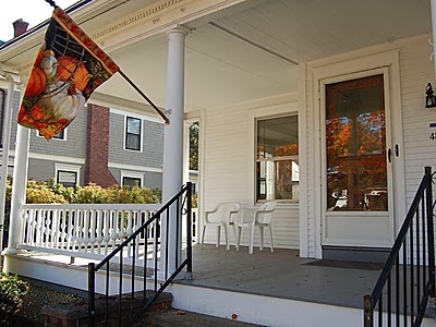
Hello! Our Springfield journey continues with this 1904 charmer in Springfield, Massachusetts. I was getting ready to do a President's Day post instead, but I couldn't wait to show this to you first. You'll just have to keep coming back, now, because I'm all excited about that house, too. Let's kick things off with this welcoming front porch.
Let's just add a little color. This is by Svilha Paxton Design.

Not sure that couch is practical for our porch, but aren't those pillows striking? I don't know how I feel about the whole garden stool trend-- they always say you can use them for extra seating, but would you really? This one looks pretty here, though. This crisp and tailored design hints at what we'll find inside.

Here in the foyer, I'd like to see a pop of color on the wall by the stairs, to kind of draw your attention away from the kitchen. It's not a big space, but I found this.

The lantern, table and chair are all by Oomph Designs. The table comes in a bunch of colors, if orange isn't quite your thing. I like how simple this is, for our little foyer space.
From the foyer, we get a glimpse into the living room.

When I saw this, I thought of a picture I had kept from Traditional Home Magazine in 2008. I can't remember the name of a person I'm talking to as I'm talking to them, but I can remember a home from an old magazine. My brain is a scary place. Scarier still is that I could find the picture I wanted on the Internet with almost instant gratification.

This is Sue Ruge's home, decorated by Svilha Paxton. You can't get much more crisp than with a nice black and white check. I think this house lends itself to a really clean-lined and timeless look. Across the room, let's have something like this.

This is from designer Jill Hinson's pretty home. Monograms = timeless.
Next we move to the dining room.

I wanted to continue the black and white in here, and let me tell you, it was a bit of challenge. Black windsor chairs were too country, and black velvet with heavy drapes were too formal. I think I found something in a middle ground.

Unfortunately, I can't credit this picture. This appealed to me because the black elements can be as many or few as you want to carry the look. The lampshades could easily be switched out, as could the rug. What I really like is if the black bands on the chairs are only tacked on to slipcovers, you could switch colors for a variety of looks. Say you wanted to bring the orange from the foyer table on them instead- that could be very striking.
Now let's go upstairs.

All of this tailored, black and white decorating reminded me of Sarah Richardson's sidekick, Tommy Smythe. See that blue/gray bedroom on the left? That one's for him.

I think he'll feel right at home. Here's another bedroom with a pretty feature window.


This room was featured by Better Homes and Gardens. I like the idea of the open headboard in front of those windows. Again, a very crisp and timeless look. The other side of the room could look something like this.

Cozy yet tailored space by designer Steven Gambrel. (Amazon affiliate link.)
Let's wrap up our tour with a quick peek into the basement space.

Ok, let's say this is the kids' play area, and imagine a cute bench/reading nook under the stairs there, similar to Steven Gambrel's above. I had fun imagining what a crisp and tailored hangout might look like, and came up with this from Sabal Homes.

A black and white teepee, of course. (Or tipi, if you are reading from my kids' textbooks.) Tommy would approve. Plus, wouldn't all those lanterns cheer you up on the way to the laundry room? Here is Land of Nod's teepee version, so there's no reason you can't have one, too.

That was a fun tour. I like this classic house. Please visit my Pinterest boards for more of this style and others-and maybe see little hints of what's to come? 3 Springfields down, 32 to go! Thanks for reading!

